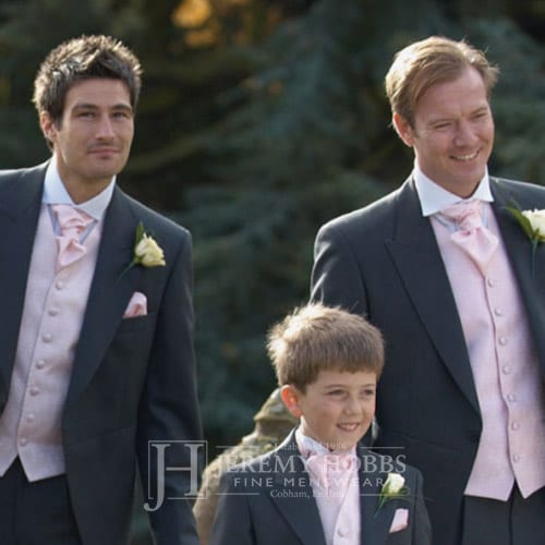
Jeremy Hobbs
The main focus of the website was too keep with the traditional upmarket feel of the brand together with a modern usability and ensuring the website is as future proof as possible.
Since taking on the website build, we now also look after Jeremy Hobbs weekly newsletters on an ongoing basis.
Brand Colors
We chose these colours in order to keep in with their existing colours so not to cause to much change with their current shop front as well as the marketing material they currently had while maintaining the upmarket feel of the brand.
Your online presence is what helps businesses grow by having a high visibility among potential customers.
Nero
#282828
Grey
#777777
Bright Blue
#2f5ba9
Website design and build
The main focus of the website was too keep with the traditional upmarket feel of the brand together with a modern usability and ensuring the website is as future proof as possible.
Since taking on the website build, we now also look after Jeremy Hobbs weekly newsletters on an ongoing basis.


